Accordion

The Widgetkit Accordion enables you to display a set of items in a compact space. When clicking on each item's header, it expands or collapses its content section.

Features

  • Clean and very lightweight code
  • Responsive design to fit all device resolutions
  • Smooth transitions on content section toggle
  • Option to automatically match the height of varying content
  • Option to auto collapse or allow multiple opened items
  • Built with HTML5, CSS3, PHP 5.3+ and the latest jQuery version
  • Works with Joomla and WordPress

Example

Slide 1

Icon 01

Headline

Lorem ipsum dolor sit amet, consectetur adipisicing elit, sed do eiusmod tempor incididunt ut labore et dolore magna aliqua.

Slide 2
Icon 02

Headline

Lorem ipsum dolor sit amet, consectetur adipisicing elit, sed do eiusmod tempor incididunt ut labore et dolore magna aliqua.

Slide 3
Icon 03

Headline

Lorem ipsum dolor sit amet, consectetur adipisicing elit, sed do eiusmod tempor incididunt ut labore et dolore magna aliqua.

Slide 4
Icon 04

Headline

Lorem ipsum dolor sit amet, consectetur adipisicing elit, sed do eiusmod tempor incididunt ut labore et dolore magna aliqua.

How To Use

The Widgetkit Accordion lets you easily create and manage all the accordion's contents through the user-friendly Widgetkit administration interface. After you have created an accordion, you can load it anywhere on your website using shortcodes or the universal Widgetkit Joomla module or WordPress widget.
Features

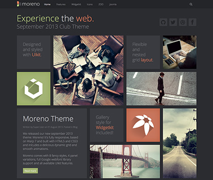
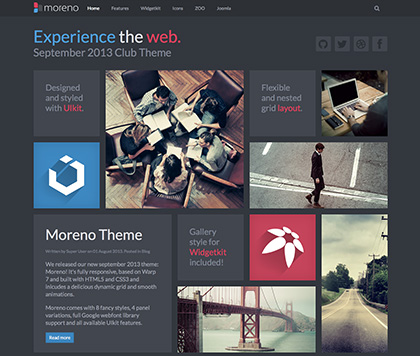
This theme is built on the Warp framework, a well-engineered theme framework for WordPress and Joomla, and utilizes all of its latest features. The user interface is powered by UIkit, a lightweight and modular front-end framework, which provides the theme's styling. The theme also comes with a wide range of different layouts and widget variations.


Styles

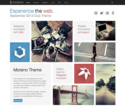
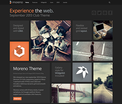
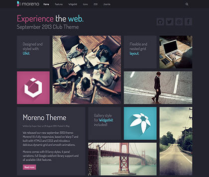
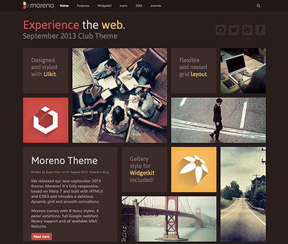
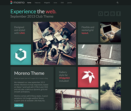
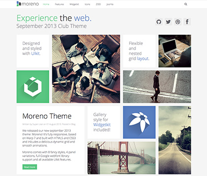
We provide lovingly crafted style variations to give you a glimpse of what is possible with this theme. The built-in theme customizer allows you to modify colors, fonts, sizes and much more without any CSS knowledge. Just choose your colors with the color picker and adjust the theme with only a few clicks. Click on one of the images to see the style.

Load Style
 
Default
Load Style
 
Blue
Load Style
 
Grey
Load Style
 
Orange
Load Style
 
Pink
Load Style
 
Red
Load Style
 
Turquoise
Load Style
 
White

Mosaic grid

Moreno comes with a special module position where you can publish modules with special sizes like 1x1, 1x2, 2x1 and 2x2. These modules will automatically adapt to the screen resolution with a cool animation.

Article style

You can select a special article boxed style within the Warp admin panel. This will make your page articles look like the panels.


Social Icons

Use the modifier .uk-icon-button class to create an icon button.


Here is a little code example how to add them:

  <a href="#" class="uk-icon-button uk-icon-twitter"></a>
  <a href="#" class="uk-icon-button uk-icon-facebook"></a>
  <a href="#" class="uk-icon-button uk-icon-google-plus"></a>

Here is an overview of all icons provided by Font Awesome.

Dummy Content

Lorem ipsum dolor sit amet, consectetur adipisicing elit, sed do eiusmod tempor incididunt ut labore et dolore magna aliqua. Ut enim ad minim veniam, quis nostrud exercitation ullamco laboris nisi ut aliquip ex ea commodo consequat. Duis aute irure dolor in reprehenderit in voluptate velit esse cillum dolore eu fugiat nulla pariatur. Excepteur sint occaecat cupidatat non proident, sunt in culpa qui officia deserunt mollit anim id est laborum.

Join William Hill Poker nad play.